The Inequality Blog

In the arguments about how wealth and income are shared out, one of the common lines is that poverty matters, but inequality, in the sense of the gaps across all of society, is a distraction. This is usually buttressed with a reference to China: just look, people say, at the way that hundreds of millions of people have been pulled out of poverty, even as the gap between the rich and the rest has widened. Inequality doesn’t matter; fostering economic growth is the key.

This week’s report from Oxfam – the one pointing out that 62 billion years have as much wealth as half of the world’s population combined – neatly destroys that argument.

It acknowledges that, between 1990 and 2010, the number of people in the world living below the extreme poverty line halved. But, crucially, it also points out:

Yet had inequality within countries not grown during that period, an extra 200 million people would have escaped poverty. That could have risen to 700 million had poor people benefited more than the rich from economic growth.

The point here is that although countries used some of their economic growth to lift people out of poverty, a disproportionate amount of that growth went to the already rich. Had the growth been fairly shared, poverty would have fallen even more.

The reason that growth wasn’t shared fairly is to do with inequality: the failure to curb monopolies that benefit the wealthy; a lack of bargaining power for workers that sees them unable to claim their share of company profits; weak tax and benefit systems that don’t provide an adequate safety net or recognise the gains everyone gets from public infrastructure; corruption and other ways that wealth influences power. Underlying all that are attitudes about inequality – beliefs that some people are more deserving than others.

So, yes, you may need economic growth to lift people out of poverty; but if you don’t think about how it will be shared, it’s going to be severely limited in its effectiveness. Shared economic growth is a key challenge of the years ahead – and that forces us to think about inequality.


Permalink

A couple of weeks ago, a report from Credit Suisse claimed that New Zealand had the highest median wealth in the world. At the time, I questioned the claim: could the average New Zealander really be wealthier than the average Swede, Australian or Dane? I also thought the figures were well out of line with what my own research was showing.

Turns out I was right to be sceptical. Both the Reserve Bank, whose data the report used, and I got in touch with the report’s authors, and they have confirmed there was an error in the New Zealand figures – due to problems, indeed, with the exchange rate conversion.

The report’s authors have said that the correct figures show the average New Zealander with wealth of around US$252,000, as opposed to the US$401,000 originally quoted. That puts us roughly in the middle of the pack with other Western countries, as one would expect. (And the point remains that those figures are still inflated by our massively over-valued housing market.)

The report’s authors will investigate correcting the online version of the report, and I’ll be contacting the New Zealand newsdesks who have run the story to see if they will do likewise.

The lesson from all this? If something doesn’t seem right, apply your ‘basic common sense’ test, even for well-regarded international reports.

On a related note, for the latest data on this country’s wealth and how unequally it is distributed, you can pick up a copy of my book Wealth and New Zealand from November 9.

Finally, thanks go to the Reserve Bank communications team for following up on this.

Permalink

The Dominion Post is running an opinion piece of mine this morning, comparing the cost of paying the Living Wage to Wellington City Council staff (about $1.7 million a year, on campaigners’ estimates) with the payments for the council’s senior staff in recent years. Below is a spreadsheet with the details of the calculations.

What I have done is take the data from the council’s last four annual reports, which is when they started reporting on the number of staff earning over $100,000. They don’t give exact salary figures for each staff member, in order to protect privacy; instead, they list how many staff members are in the salary bands over $100,000, e.g. $200,000-$280,000.

To come up with the total payments each year to staff who earn over $100,000, I have taken the number of staff in each bracket, assumed they are all earning the midpoint of that bracket, e.g. $240,000 in the example above, and then multiplied the two figures. I have also taken out one of the figures in the top bracket, since that has to be the chief executive and their salary is listed separately. What the figures show is a substantial (30%) increase in both the number of staff earning over $100,000 and the total payments to those staff.

Year         Staff on $100k+        Salary bill for $100k+ earners

2011-12       148                                    $20.4 million

2012-13       155                                    $21.7 million

2013-14       174                                    $24.8 million

2014-15       192                                    $26.8 million

As can be seen, the cost of the Living Wage is about 6.4% of the salary bill for the highest earners, implying that restraint at the top would create ample room for the increases at the lower end.

One question is how much of this increase – about $6.4 million – is an actual increase in pay and how much is just the effect of greater numbers, i.e. people moving up over the line and thus bringing another $100,000 of income into the figures. You can estimate that by taking the increase in staff numbers – 44 – and subtracting the amount they bring into the figures (44 times $100,000 = $4.4 million) from the increase. That leaves about $2 million – still enough to cover the Living Wage costs to the council of around $1.7 million, according to campaigners’ estimates. (Although there will still be pay increases being contributed by those staff, since they are clearly rising in salary, and one could also question the necessity of that number of staff being on or nearly on $100,000.)

Now, it could be that even more of the increase is due to new people coming in (if they were employed in new positions on, say, $250,000). But I’m not aware of that happening at WCC recently; in general, the council has been downsizing, not taking on new staff. And even if that is occurring, it still represents a high pay phenomenon – the employment of larger numbers of highly paid managers – that is a deliberate HR policy. The WCC could take a different policy, that of enabling more staff to be self-managing and flattening management hierarchies, thus eliminating tiers of management and freeing up income to pay lower-paid staff more.

Either way, the point remains that the WCC has a substantially increased upper salary bill, compared with even a few years ago, and the alternative has been open to them to redirect that salary bill increase towards their lowest paid earners. And the costs of increases at the lower end are a very small fraction of the highest earners’ salary bill.

WCC highest salaries 2012-15 web

Permalink

Reporting on the latest Credit Suisse Global Wealth Report has repeated its claim that New Zealand has the second highest average (mean) wealth in the world – and the highest median wealth.

But is that true? It sits oddly with personal experience. Does anyone who has been overseas, or seen other countries depicted, think that we are wealthier on average than the Swedes? The Dutch? The French? The Canadians? The Norwegians? The Australians? It seems unlikely.

The only possible explanation, for me, is that our figures, if they are correct, are being bumped up by our massively overvalued housing. And the figures do seem to be taken from the Reserve Bank’s household balance sheet, which includes the value of housing. In which case, this measure of wealth isn’t perhaps the most useful (in a popular context, anyway), since it is just capturing the size of our housing bubble.

More fundamentally, though, I’m not sure the figures are correct. They claim household wealth in New Zealand is US$1.3 trillion, around NZ$1.9 trillion, but the relevant Reserve Bank figures seem to indicate a much lower figure around NZ$1 trillion.

The report claims the median wealth in New Zealand is US$182,000 – nearly NZ$270,000. But the 2010 Survey of Family Income and Employment, analysis of which I’ve recently been involved in, puts median individual wealth at about a third of that figure, and I can’t imagine it has tripled in a few years. Next month I’m publishing a book, Wealth and New Zealand, that will bring these figures – and more – into the light.

The Credit Suisse report also takes its figures for the distribution of wealth from a survey in 2001 – now 14 years out of date, and not even the most up-to-date survey available to the report’s authors.

I’m hoping to talk to the report’s authors and puzzle some of these things out, but until then, I would take its conclusions with a grain of salt.

Permalink

A little while back, Finance Minister Bill English gave a speech in which he claimed that “poor urban planning is one of the significant drivers of inequality”. His logic is that bad urban planning drives up the cost of building new houses, limiting supply and thus causing rents to rise sharply and house prices to skyrocket. This effect is felt most strongly by the poor, who pay more of their income on housing costs, and so it widens income gaps.

Leaving aside whether urban planning is really to blame for the housing crisis, these claims are part of a wider government argument that housing is a key driver of inequality – an argument they make, sceptics would say, because it’s an area they happen to be taking action on already. Now, it’s true that, as English says, “the gap between incomes measured before housing costs and after housing costs is growing. Housing costs are becoming a larger proportion of incomes – and that matters the most at the bottom end of incomes among people who have few choices.” So it’s good to see the government recognising this fact.

But just because housing costs are making inequality worse doesn’t mean that they are the main driver, or even “significant”. Running the numbers on this, which I’ve just got around to doing, makes the point. The 2015 Household incomes in New Zealand report shows that in 1982, someone just on the edge of the poorest tenth of the country had housing costs of $4,200, on income post-tax of around $15,000.

By 2013, that same person had housing costs of $7,300 on around $17,700 of post-tax income. So housing costs are clearly a massive issue for poor people, consume a large chunk of their income, and have increased for them by around $3,000 in 30 years. (And, the maths show, have left poor people poorer than they were 30 years ago, despite all the promises of economic growth and so on.)

But housing costs have increased at the richer end a little bit as well, so in the end housing costs by 2013 were widening the rich-poor gap (that is, pulling the poor down more than they pull down the rich) by about $2,200 more than they did in 1982. (If that statement isn’t completely clear, well, there’s no simpler way to put it, sadly.) That’s housing’s contribution to increased inequality – $2,200. But in the same period, the overall rich-poor gap widened by nearly $21,000.

That implies that the increased housing cost contributed about one-tenth of the overall increase in inequality in the last 30 years – not nothing, but hardly enough to qualify housing in general – let alone poor urban planning, which is just one part of the housing issue – as “one of the significant drivers” of inequality.

Permalink

The combined wealth of New Zealand’s Rich Listers in 2015 turns out to be $57.4 billion, around $2.4 billion higher than initially estimated and a striking 12 per cent increase on the previous year’s figure.

When the Rich List was announced in July this year, the National Business Review (NBR) put the value of its 184 individuals and families at $55 billion. (The cut-off for inclusion is having a fortune over $50 million.)

But when I tallied up the entries for each individual/family listed on the website (as preparation for some data analysis), the total came to $57.4 billion.

The explanation, kindly provided to me by NBR staff, is that there were a couple of late-breaking big revaluations owing to shifts in the New Zealand dollar and other currencies. (Since many of the Rich List hold part of the fortunes overseas, shifts in exchange rates can make a big difference to their net worth.) These revaluations made it onto the website figures but not the commentary or the print version.

The result of this correction is that the year-on-year rise in the Rich List’s value was 11.7 per cent over 2014’s figure of $51.2 billion. That’s a pretty striking increase at a time when Reserve Bank figures show households have in the last few years reverted to going into debt rather than saving, and probably only people who own houses in desirable parts of Auckland will have seen their wealth increase by anything like 12 per cent.

Some would say that such a big shift in value just because of currency changes points to the inherent inaccuracy of the Rich List’s figures. But I think it just reflects the fact that these wealthy individuals do have huge variations in their net worth, with sums unimaginable to most of us appearing and disappearing in the blink of an eye.

And it’s worth noting that Thomas Piketty, one of the world’s foremost experts on wealth, uses such surveys in his work and believes they help “impose some discipline on public debate”. Certainly the fact that the Rich List’s value has (once adjusted for inflation) risen from $12.6 billion in 1986 to $57.4 billion today is a useful one to know, and gives us a sense of how much fortunes have increased at one end of the scale (even as debt has increased at the other).

Permalink

Following the announcement that the Green Party’s Russel Norman would be stepping down, to be replaced by Marama Davidson, I did this chart of Parliament’s gender breakdown.

Gender inequality in Parliament

It doesn’t make pretty reading.Only the Greens have more female MPs than male. Labour have 12 female MPs to 20 male (although if they had won more seats, their list was designed to get pretty close to gender parity at around the 40-seat mark). National have 17 female MPs to 42 male. New Zealand First has three female MPs out of 12 in total.

Overall, just 41 of the 121 MPs are female – almost exactly one-third.

Responding to this graph on Twitter, National Party member Hamish Price said the answer was to do a serious outreach campaign to women who could stand for Parliament but don’t because it seems like a forbidding and complex process.

The response from the other side of the debate would be that such outreach is all very well, but doesn’t address the deep-seated sexism that exists in politics and which blocks women from getting into electable positions.

It’ll be interesting to see where that debate goes.

Permalink

This document summarises the key points on inequality and poverty from the 2015 Household Incomes Report, published by the Ministry for Social Development.

Inequality

On most measures, income inequality is either at the highest level it has been since records began in 1982, or is very close to that level. It has also risen sharply in both the last two years.

The government generally claimGini coefficient 2015
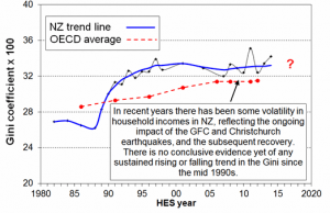
s that inequality is not increasing. The Household Incomes Report, which is quite rightly cautious, continues to say there is no “conclusive” evidence of rising inequality. But as the graph (at left) of the Gini coefficient shows (in which 0 is perfect equality and 100 is perfect inequality), it is starting to look like an upward trend, and the Report says that one more year of data at this level will be enough for it to conclude that inequality is indeed rising.

One way to look at what has happened with income inequality recently is to consider the contrasting fortunes of different groups, as in the table below.

Group Av. income 2009 ($) Av. Income 2014  ($) Change ($) Change %
Poorest tenth 12600 No information
2nd tenth 18800 19000 200 1.1%
3rd tenth 23000 23200 200 0.9%
4th tenth 27000 27700 700 2.5%
5th tenth 31100 32400 1300 4.0%
6th tenth 35600 38400 2800 7.3%
7th tenth 41000 44500 3500 7.9%
8th tenth 47700 52800 5100 9.7%
9th tenth 58700 64400 5700 8.9%
Richest tenth 102500 108400 5900 5.4%

As can be seen, since the crisis (and the beginning of the current government’s term in office), those in the poorest groups have seen average income increases of just $200, while the increases have been of the order of $5,000-6,000 at the richest end. (There was no information for the poorest 10th in 2014 because of problems with the way that benefits income was recorded.)

Poverty

Total poverty has been relatively steady since the global financial crisis, under the measures that look at how many households (HH) have less than 50% or less than 60% of the typical household’s income (adjusted for household size). However, poverty is far higher than in the 1980s.

Year       HH under 50%   HH under 60%

1986                       6%                          13%

2009                       10%                        19%

2014                       10%                        20%

On the under 60% figure, and assuming a population of 4.42 million, there are approximately 880,000 New Zealanders in poverty.

When housing costs are taken into account, the above trends and figures are roughly the same, with the difference that the under 50% rate has gone from 13% in 2009 to 15% in 2014, indicating that housing costs make the biggest difference among the very poorest, and are increasing. After housing cost poverty is roughly double its 1980s level, again pointing to housing’s growing role.

Child poverty

There are many different measures for child poverty, as the table below shows. However, the overall trend is for an increase in child poverty of somewhere between 10,000 and 45,000 children since 2009. The exception is the ‘anchored line’, which looks at how many children are under the 2007 poverty line (as opposed to how many are under today’s poverty lines). But even here, where one would expect poverty to decline consistently as the economy grows, the figures look static.

  Before housing costs After housing costs
  BHC ‘moving line’ AHC ‘moving line’ AHC ‘anchored line (2007)’ 
HES year 50% 60% 40% 50% 60% 60% (07 ref)
2001 120,000 250,000 115,000 215,000 310,000 380,000
2004 150,000 265,000 115,000 200,000 285,000 320,000
2007 135,000 210,000 115,000 175,000 240,000 240,000
2009 125,000 230,000 140,000 210,000 280,000 255,000
2010 150,000 250,000 120,000 210,000 315,000 275,000
2011 145,000 235,000 130,000 210,000 290,000 270,000
2012 130,000 225,000 135,000 215,000 285,000 255,000
2013 120,000 215,000 135,000 205,000 260,000 235,000
2014 150,000 250,000 220,000 305,000 245,000

Reference: Household incomes in New Zealand: Trends in indicators of inequality and hardship, 1982 to 2014, MSD

Permalink

Did the small child poverty package in May’s Budget makes the issue go away for National? Not in the slightest, according to the polling shown in the graph below. Concerns about poverty and inequality, which had already skyrocketed since 2010, have only increased in recent months – and the last poll was taken in June, when the Budget would have been most in people’s minds.

Roy Morgan polling July 2015Note, also, that concern has continued to rise since last year’s election, when you might reasonably have expected it to die down for a while, as the campaigners in that field took a bit of a break.
So clearly, this isn’t an issue that is going to go away quickly. And that’s not surprising. The Budget’s announcement that core benefit rates would rise for the first time in 40 years marked a huge ideological shift, after decades of arguments that keeping benefits low was important for ‘incentives’. But in practical terms, it didn’t deliver much: just $25 a week, some of which would be clawed back in reduced housing allowances and so on.
And when it comes down to it, I don’t think that what lies behind the huge concern about poverty and inequality is a whole bunch of people thinking, ‘Gosh, if only poor households had another $25 a week, everything would be all right.’ That’s not what is going on in people’s minds. The concern goes much deeper than that. People see kids going to school without food (or at least they did while Campbell Live was running). They see increasing concentrations of advantage and disadvantage. They see the unbelievable rates of Third World childhood diseases (thanks to Bryan Bruce’s documentaries).
While I wouldn’t argue that the bulk of the public understands the issues in detail or knows how to tackle them, I think the concern about inequality and poverty is a deep one. The words have entered the mainstream narrative about this country (and rightly so), and changing that will require big, structural shifts, not $25 here and there.
In electoral terms, it’s a different matter. The Budget’s package may be enough to keep swing voters happy and stop them moving over to Labour. But without bigger change, the issue will continue to haunt our government, whichever party may be running it.

Permalink

At the end of last week, there was a brief flare of outrage about a shot from Beyonce’s new video (available only on Tidal), in which she apparently pours a bottle of champagne worth thousands of dollars into a swimming pool. As someone observed on Twitter, when there are people starving and homeless, this isn’t such a great look.

It has to be said that, on the scale of ridiculous and wasteful things that celebrities do, Beyonce’s act, though particularly blatant, isn’t a huge misdemeanour. But it’s fascinating that it attracted such criticism, when you consider that Beyonce is an especially glittering celebrity, one often lauded for her stance on issues such as feminism.

It’s fascinating, too, to think about this criticism in the context of another incident of a celebrity deliberately spilling drinks into the pool. I’m thinking, of course, of the gesture that in many ways sums up the 1980s, the moment in the video for Club Tropicana when George Michael pours his cocktail into the rippling blue waters on which his lilo floats.

While I was barely sentient at the time the video came out, I don’t recall that at the time when I did finally see it, sometime in the 1990s, there was any outrage expressed, nor does a quick Google search throw up any such commentary – and nor would one expect it. At the time, such extravagance probably looked exciting, challenging, a one fingered salute to the conventionality and respectability of previous eras. It would have been legitimised, too, by the ideology sweeping the world at the time, the one that held that greed was good and that concerns about inequality either reflected a small-minded desire for conformity or were simply irrelevant.

We live in a changed world now. Most people are aware, on some level, of the dark side of George Michael’s insouciant flip of the wrist – the spiralling gap between the haves and have nots that has opened up in the last 30 years. In this light, Beyonce’s champagne spillage looks much less exciting, and much more offensive.

This is not to say that I expect anytime soon a revolt against the celebrity system and its excesses, which go far, far beyond anything one hip hop star might do in a music video. And it’s dangerous to read too much into two snapshots. But I still think that last week’s reaction is another pointer to the public’s decreasing tolerance for inequality – and that this might be a good thing.

Permalink