This year’s Household Incomes in New Zealand, a key report on poverty and inequality published yesterday, bears very little to cheer about. Key points below.
Inequality has risen slightly post the global financial crisis, reversing the decreases we saw before that thanks to policies like Working for Families. Since 2009, incomes have been static or falling for people in the poorest half of the country, but increasing for the rich, though without really taking off, as they have done in, say, America.
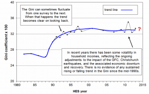
The Gini coefficient, a standard measure that adds up all the income gaps in a country and in which a high score indicates high inequality, is shown in the graph below. The gentle decline in the early 2000s, and the gentle rise post-2009, are both clear.
Also, don’t forget the real story about inequality, which is very clear from the graph: the huge surge we saw in the 1980s and 1990s, which was the biggest in the developed world, and which has left us far, far more unequal than we were 30 years ago.
On another measure, we can look at how much someone in the richest 10% earned compared to someone in the poorest 10%. The average rich person now earns 7.5 times as much as the average poor person, whereas they used (in the 1980s) to earn 4.5 times as much. That’s a big shift.
That story holds if we look at the figures just for the last few years. Since 2010, the average person in the richest 10% is nearly $10,000 better off. But the average person in the poorest 10%? They are just $200 better off.
Poverty rates remain high – double what they were in the 1980s. Around 18% of the total population (adults and children) were in poverty in both 2009 and 2013. (That’s using the measure that people are in poverty if they have less than 60% of the average income, accounting for household size and housing costs.) That means almost 800,000 people are poor, out of 4.4 million.
For children, the number in poverty (using the same measure) has fallen in the last year, from 285,000 to 260,000, for reasons that are so far unclear.
Regardless, these rates are still far, far higher than a generation ago. The percentage of all people in poverty was 9% in the mid-1980s; now it’s 18%. The percentage of children in poverty was 11% in the mid-1980s; now it’s 24%.
3 comments on “The big rise in inequality unchanged by the latest Household Incomes report”
Hi Max,
I enjoy reading your articles. I have a question though whether the HES report is comparing apples with apples.
See page 37 of the word document version of the HES which defines “income”. It explicitly excludes capital gains as income but in the footnote says:
[quote]
A capital gain or loss for a household is treated as a change in net worth or wealth, except where the proposed “capital gain” is in fact income as defined by tax law.
[/quote]
Note that the report is about “income” and not wealth – the report makes this clear in many different places. Almost apologetically so.
So NZ “incomes” exclude capital gains but all the OECD countries we’re ranked against; which have a CGT tax and therefore would include capital gains via their IRD figures; include capital gains? Surely comparing apples with oranges?
Hi Chris, sorry, missed this comment. I think it is apples and apples, though. The HES is a household survey, as are the surveys the other OECD countries use, and the convention for all those surveys is that you don’t include capital gains, because technically it’s a change in asset holdings not income. None of those surveys uses IRD data or similar – that’s a whole different kettle of fish. So I think the comparisons are OK.
I am going to read the 2012 and 2013 reports carefully together. But I am already puzzled by one thing I found in the two reports. In Figure I.1 in both (page 141 in the 2012 report and page 165 in the 2013 report), the two tables look completely different in their structure around the $12,000 to $54,000 marks but the tables identify the mean ($40,000) and median ($33,300) as being exactly the same in both. How can this be? Surely they would have changed even just a little bit by 2013?
 Also, don’t forget the real story about inequality, which is very clear from the graph: the huge surge we saw in the 1980s and 1990s, which was the biggest in the developed world, and which has left us far, far more unequal than we were 30 years ago.
Hi Max,
I enjoy reading your articles. I have a question though whether the HES report is comparing apples with apples.
See page 37 of the word document version of the HES which defines “income”. It explicitly excludes capital gains as income but in the footnote says:
[quote]
A capital gain or loss for a household is treated as a change in net worth or wealth, except where the proposed “capital gain” is in fact income as defined by tax law.
[/quote]
Note that the report is about “income” and not wealth – the report makes this clear in many different places. Almost apologetically so.
So NZ “incomes” exclude capital gains but all the OECD countries we’re ranked against; which have a CGT tax and therefore would include capital gains via their IRD figures; include capital gains? Surely comparing apples with oranges?
Hi Chris, sorry, missed this comment. I think it is apples and apples, though. The HES is a household survey, as are the surveys the other OECD countries use, and the convention for all those surveys is that you don’t include capital gains, because technically it’s a change in asset holdings not income. None of those surveys uses IRD data or similar – that’s a whole different kettle of fish. So I think the comparisons are OK.
I am going to read the 2012 and 2013 reports carefully together. But I am already puzzled by one thing I found in the two reports. In Figure I.1 in both (page 141 in the 2012 report and page 165 in the 2013 report), the two tables look completely different in their structure around the $12,000 to $54,000 marks but the tables identify the mean ($40,000) and median ($33,300) as being exactly the same in both. How can this be? Surely they would have changed even just a little bit by 2013?