CORE DATA
This page sets out basic information about economic inequality in New Zealand. For more detailed accounts, see the Books page.
Definitions
There are many kinds of inequality, and many ways in which people can have unequal outcomes: based on their region, age, gender, ethnicity, and so on. This site focusses on inequality of income and wealth, sometimes known as economic, material or resource inequality.
Income is the money that comes in week to week or month to month, while wealth is people’s stored up assets, like houses, KiwiSaver investments, or cash in the bank. Income is what people need to get through the present, while wealth allows them to plan for the future and make investments.
Income and wealth inequality is a question of who gets what and the fact that some people have much greater or lesser resources than others.
Material issues
Income and wealth aren’t the only things that affect individual’s lives and the shape of society. But they do make a big difference to the kinds of lives people can lead: individuals with sufficient income and wealth are much better able to pursue their dreams, and achieve their ambitions, than those without. Large income and wealth imbalances can also drastically change the nature of a society, making it more divided, less cohesive and connected. So it matters how income and wealth are shared out.
Technical details
Income inequality is usually calculated based on after-tax income (as that’s what people can actually spend) and on a household basis (as most people spend money as part of a larger family unit).
For wealth inequality, the measure is individual (or sometimes household) net worth, which is someone’s assets (what they own) minus their liabilities (their debts, or what they owe).
Income inequality
When it comes to income disparities, New Zealand is one of the more unequal of the richer nations. The graph below shows the OECD, sometimes called the ‘club’ of richer nations, minus the low-income countries to which New Zealand does not usually compare itself (Mexico, Chile, Costa Rica and Turkey). The measure is the Gini coefficient often used by statisticians, which adds up all a society’s income differences and combines them into one number. A Gini coefficient of 0 would indicate perfect equality (everyone has the same income) while 100 would indicate perfect inequality (one person has all the income). New Zealand is towards the unequal end of the spectrum.

New Zealand’s high level of income inequality is largely the result of policy changes in the 1980s and 1990s, when the country had the biggest increase in income disparities of any OECD nation. The graph below shows what happened to the incomes of four typical New Zealanders – someone in the poorest tenth of the country, the middle, the richest tenth and the richest 1% – between 1982 and 2019. The bottom three groups have their after-tax income displayed, while the top group has pre-tax income. All incomes are inflation-adjusted.
As can be seen, the average income (before tax) of someone in the richest 1% doubled in that time, from just under $200,000 to over $400,000. Incomes for the richest 10% also increased, though not as sharply. In contrast, the average disposable (after tax) income for someone in the poorest 10% was only one-third higher than it was in the 1980s. Middle incomes also did not grow significantly. The economy that emerged from the 1990s was one that delivered the largest rewards to those who were already earning the most.
(Survey issues mean there is no after-tax income data for the richest 1%. If it were, the line for the 1% would be lower than shown. However, the slope of the increase in the top 1% income would be even greater, given that taxes levied on the 1% have fallen during this period.)

The graph below shows another way to present the same story. Someone in the richest 10% would, in the 1980s, earn five-to-six times as much as someone in the poorest 10%, but by 2019 they earned nine times as much.

Wealth inequality
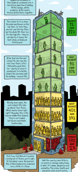
Wealth – houses, businesses, cars, financial investments – is even more unequally distributed than income. In New Zealand the wealthiest 1%, around 40,000 adults, own one-quarter of the country’s assets, while the poorest half of the country has just 2 per cent.

Toby Morris’s Wealth Inequality Tower is a more striking way to visualise the same information. (The data in the tower are slightly different to those above, but the core story is the same.)