The story of economic inequality in New Zealand can be told through income and wealth, but there is data going further back for the latter.
Wealth inequality
The table below shows the share of assets owned by the wealthiest 1% and the wealthiest 10%, from the 1890s to the present day. Inequality in the 1890s was startlingly high: the wealthiest 1% had two-thirds of all assets. This was in part owing to colonisation, in which the Māori asset base – notably, land – was systematically alienated, much of it stolen or dubiously purchased. One consequence is that large tracts of the South Island were owned by small handful of men known as the ‘Great Sheep Lords’; many of them were in the 1% in the 1890s.
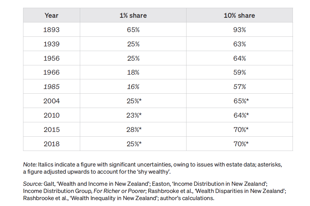
By the 1930s, inequality had fallen sharply. Even by the 1890s, animosity had been building towards the Great Sheep Lords, and the government began “bursting up” the big estates by compulsorily purchasing them and selling them off in small chunks to less wealthy New Zealanders.
In addition, the Great Depression of the 1930s destroyed much wealth, in New Zealand as elsewhere. Perhaps more importantly, and more enduringly, the shared misery of the depression and two world wars laid the foundation for governments to create a more egalitarian political settlement. Back in the 1890s, the Liberals had – even while further disenfranchising Māori – created the first vestiges of a welfare state, including old-age pensions. In the 1930s, those policies were taken much further by the first Labour government, which introduced the modern welfare state as we know it, as well as a public health system and tens of thousands of state houses.
The “post-war consensus”, largely supported by both left and right, included other policies that restrained wealth inequality. Top tax rates were high (over 60% on the largest incomes), while a strong trade union movement ensured that a relatively large share of company income went to workers, as opposed to directors and shareholders. This was not a “golden age” for everyone, as Māori – though increasingly pushing back against the effects of colonisation – remained poorer than Pākehā, opportunities for women were limited, and Pacific immigrants were subjected to the notorious “dawn raids”. Overall, however, wealth disparities were relatively low, and falling. By the early 1980s, the share of the wealthiest 1% had probably fallen to a ‘mere’ 16% of all assets (although the data are sketchy at this point).
However, the post-war consensus was already under strain, as New Zealand’s traditional export markets dried up, the economy was increasingly regarded as overly protected from international competition, and the Prime Minister, Robert Muldoon, tried to exert unusual control over the economy through wage and price freezes. In response, the fourth Labour government introduced ‘Rogernomics’, a market-based approach that emphasised tax cuts, privatisation of state assets, deregulation, and attempts to run public services more like markets. State assets in railways, forestry and other areas were rapidly sold off (largely to the benefit of the wealthiest 10%, who own most shares), and the top tax rate was cut from 66% to 33%. These policies were continued by the National government in the 1990s, which cut benefits by roughly one-quarter in the 1991 ‘Mother of all Budgets’, sold off state housing, and made union organising extremely difficult through the Employment Contracts Act.
The effects of these changes can be seen in the wealth inequality data, which suggests that the wealthiest 1% share has returned to approximately 25%, the same level it had enjoyed before it was reduced by the policies of the post-war consensus. In this century, there appears to have been no dramatic change in wealth inequality – but only on these measures. Housing inequality has widened substantially, as homeownership has fallen and house prices have skyrocketed, increasing disparities between renters and owners. But because housing is a key asset for the ‘middle classes’ but relatively unimportant for the upper echelons (who tend to hold the bulk of their wealth in businesses and other financial investments), housing inequality is not always obvious from measures that focus on the wealthiest 1% and wealthiest 10%.
Income inequality
There is no long term data on post-tax income inequality, as the relevant surveys only began in the early 1980s, but data reported to the Inland Revenue reveals pre-tax income inequality dating back to the 1920s.
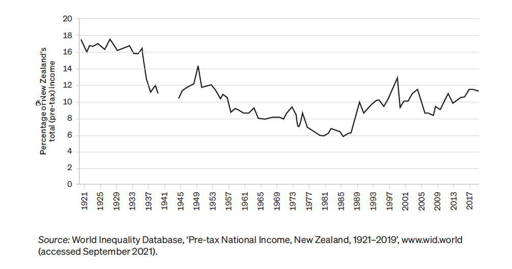
Unsurprisingly, this data closely parallels the wealth inequality data above. In the 1920s, the richest 1% of New Zealanders had roughly 18% of all the income reported to the tax authorities. That had fallen by the 1940s, and as with wealth, fell consistently during the post-war consensus period, hitting a low of about 6% in 1985. This fall occurred during both Labour and National administrations.
Again, however, inequality increased sharply in the 1980s and 1990s, thanks to Rogernomics. Today, although the richest 1%’s share has not regained its level of a century ago, it is nearly 12%, double its 1980s level.
While the income data does not go back as far as the wealth data, in recent years it has been more frequently gathered, allowing us to discuss twentieth-century changes in economic inequality in greater detail. The backdrop to those changes is the striking increase in inequality between the mid 1980s and the late 1990s, the greatest increase anywhere in the developed world at that time.
Since then, there has been no consistent pattern, but sub-trends can be discerned. Under Helen Clark’s fifth Labour government, from 1999 to 2008, the richest 1%’s share of pre-tax income appears to have declined modestly, from perhaps 12% to 9%. Under John Key and Bill English’s National government, from 2008 to 2017, it then rose by about as much as it had previously decreased, leaving it at roughly its late-1990s level.
All the above data, is, as stated, for pre-tax income. Since rich people’s disposable income is reduced by taxation (and poor people’s is increased by benefits), this data is open to the objection that it overstates income inequality. While this is true up to a point, the more limited data for post-tax income, available since the early 1980s, confirms the basic trend.
In addition to the basic measures set out here, which show a widening of post-tax income inequality, another key way to look at income inequality is the Gini coefficient. This measures all of a country’s income disparities – the gaps between how income is distributed and how it would be distributed in a perfectly even society – and adds them together. In the Gini coefficient, a higher number indicates greater inequality: 100 represents total inequality (one person has all the income), while zero represents perfect equality (everyone has the same amount). All the figures are for post-tax income inequality.
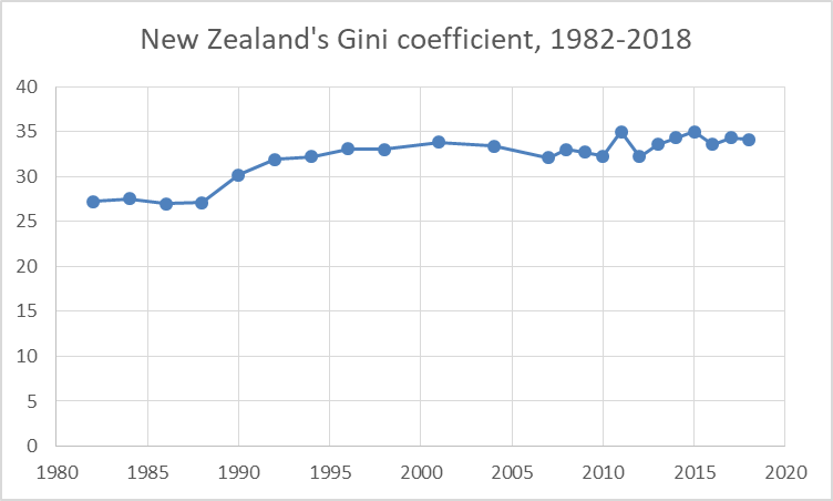
As the graph above shows, New Zealand’s Gini coefficient rose rapidly in the 1980s and 1990s. Echoing the pattern of pre-tax income inequality, it fell a little in the 2000s. This is thought to be thanks largely to Working for Families and a higher minimum wage. However, post the global financial crisis, and the accession to power of the National government, it rose slightly.
Under Ardern
It is not entirely clear what has happened to economic inequality under the post-2017 Labour governments led by Jacinda Ardern. Data released in early 2022 by Statistics New Zealand indicates that income inequality has reduced, the Gini coefficient falling from 32.7 in 2018 to 31.7 in 2021. This is a different data series to the graph above, however, making long-term comparisons difficult.
When it comes to wealth inequality, the 2020-21 Household Economic Survey showed no substantive difference from 2017-18. This may seem surprising in light of the enormous rise in house prices during this period. As above, however, this does not always show up in the standard measures of inequality.
Sources
Most of the figures are from Max Rashbrooke, Too Much Money, Bridget Williams Books, Wellington, 2021. The Gini coefficient data and figure are from Bryan Perry, Household Incomes in New Zealand, Ministry of Social Development, Wellington, 2019, p.100.