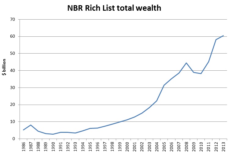
This graph, compiled by Geoff Bertram from Victoria University, emphasises how the NBR Rich List’s wealth has increased dramatically since the mid-1980s.
It also shows two things. First, the sharp rise in income inequality in the mid-80s to mid-90s has resulted in a large and lasting increase in wealth concentration. Even if income inequality has been fairly static in recent years, that wealth transfer has already been stacked up. Given the advantages that asset ownership brings, that’s a significant concern.
Second, income inequality may not have increased since the global financial crisis, but this increase in wealth is likely to translate back into increased income. This just reinforces my argument last week that we will probably see rising inequality (even in income terms) in coming years.
(Note: This graph was compiled by Bertram using 2012 dollars, and I’ve just added the non-adjusted figure for 2013. In 2012, the NBR added foreign people of wealth based in New Zealand to the list for the first time, which partly accounts for the sharp increase that year. But even if those people’s wealth is stripped out, the Rich List is still at a record high.)